It is amazing how much reflection and glossy button designs have been integrated in practically everything out there. I don’t know if it was Apple who came up with the style, but it seems thought of as the standard for everything.
Heck, even my Samsung LCD TV displays a NO SIGNAL message, complete with a glossy, reflective icon! MY TV! What the heck? My question is this…what is the next style going to be, and how dumb will that reflective,glossy button look on my TV then?
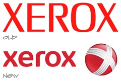
So, here are a few logo designs of brands that have been affected by the latest trend.
UPS from Flat to Glossy
JC Penney
Xerox
Chevron
GM
Pontiac
Target
Theses were just a few examples.
I can’t wait to see what designers come up with as the next standard of coolness. Hopefully bevel/emboss/drop-shadow makes a comeback.


