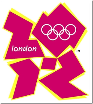
You would think Londoners would be thrilled about all things related to the fact that they will play host to the 2012 Olympic Games…but that is not true.
First off, usually the first exciting piece of marketing collateral for playing host to the Olympics is to come up with a hot and creative logo. The logo typically contains the location name, the year of the event and a neato little logo or mascot.
So let’s take a look at the hotness that London paid Wolff Olins more than £400,000 (which actually took a year to design) for:
One look at the font they use on their website and you’ll understand how they could come up with such a hideous logo.
Wow. I am totally speechless with this one. What is even more exciting is that this logo is so horrible that there is even a petition to remove this as the official logo of the 2012 London Olympics.
Some of you, who still think that bevel and emboss is still a great design option with Photoshop, probably think…hey, this logo aint so bad! Well look at the facts. Facts that prove that this logo is HORRIBLE.
1) Olympic chiefs were forced to pull the promotional video of the 2012 London Olympics because it caused seizures…at least 10 cases of epilepsy!
2) Caused people to feel dizzy.
3) Viewers experienced vomiting or headaches and a general uncomfortable feeling.
If I could find the best quote regarding the design, it would have to be this one:
“It is incredible that someone has been paid £400,000 to come up with this load of garbage.” – Tory MP Phillip Davies (Member of the culture, media and sports select committee).
Well, this is what happens when you allow those who are not qualified to judge design to be your selection committee for design.
If you are interested in submitting your own logo to help the cause of the “Revoke the 2012 Olympic Logo” movement, contact the DailyMail and send them your own version of the logo.
