I’ve recently reviewed the latest offering from Keith Wellman called “BreakThrough Wealth” and I thought he did a great job with the sales pitch page.
Some of you may not be familiar with the typical Internet marketing sales pages, but all usually fall within the same format: One column of copy with strategically placed sections and photographs. The purpose of the sales pitch page is to instill a need for a product being pushed. Essentially telling the viewer that their lives are nothing without the product being offered.
I figured I’d describe to you the essential elements for an effective, persuasive sales pitch page.
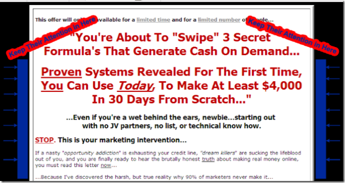
1.) Use only one centered column with enough padding to “push” the viewer eye to the center. The purpose of this is to keep the viewer’s focused on the message.
2) Make use of stand-out header text as your introduction. Notice what Keith does…”You’re About to “Swipe” 3 Secrets…” He is making use of quotes to give the impression that he is actually speaking to you.
The first section of his header text teases the view that something good is about to be revealed. His second part of the header text then explains that this soon to be revealed good thing can actually be acquired to help generate some cash, with little effort.
This is the Something big for you in exchange for something little pitch.
3) Always follow up your header text with the the sub-header text in a less noticeable black, smaller, bolded font with a message that dispels any insecurities you may have with the message being pushed.
This is the “Any schmoe can do this…even you!” reality check header follow up line. Look what Keith uses: …Even if you’re we behind the ears, newbie…
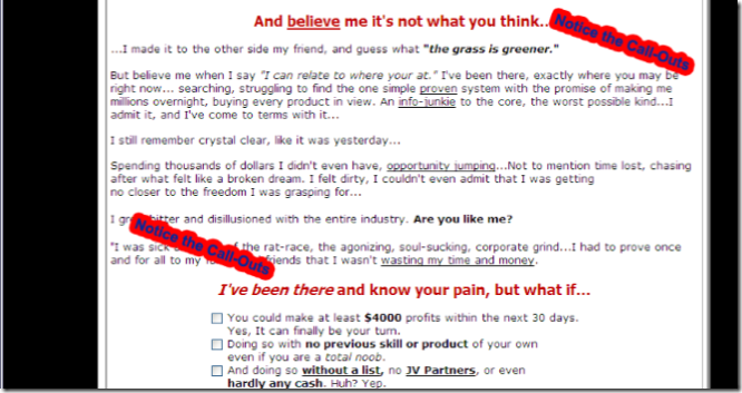
4) Keith then continues with the status quo to elaborate a little more on the message with smaller, non-bolded text. The purpose of the copy is to relate to the viewer by offering stories that you as the viewer can completely relate to. Stories that explain that the marketer was once in the position (if you happen to be so) like you, but can offer a way out.
This section is to weed out any skepticism by the viewer.
5) But, in order to send this “relating” message home, you need to make use of the bold-red callouts, strategically placed every 1- 5 paragraphs apart of the “relating” text. Look at the graphic below and you can clearly see that the red call-outs are enforcing the message that the marketers is really opening up to the viewer:
The rest of the copy should contain a few bullet list (as shown in the graphic above) to also instill a need and provide a positive end result by purchasing this product.
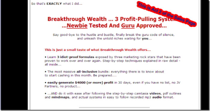
6) If you notice with this sales page (as with many sales pages of Internet marketers) the is sooo much text. So much that the user may feel overwhelmed, but possibly “biting” on the message. Why? Because this message is long so it must be important and it must be correct!
But in order to snag the hook and get the fish (the viewer) to bite, you need a new hook. Something similar to the powerful red message used at the top of the sales page. I introduce to you the “Hey Wake Up, I’m big red letters, I’m important, AND I’m revealing to you what this product is.”
7) So now, the viewer is here, but is possibly skeptical…especially after being recharged with another big-red (I call it Act-2 of the Sales Page) header, the user need some proof and told that Hey, you’ve been screwed in the past, but I’m willing to show you proof that my offering actually works. Keith’s is a total masterpiece:
You’ve Been Spoon-Fed Dirty Lies, Deceived By
“Clown Princes”, Who Want To Keep You In The Dark…
These Jokers Are Willing And Ready To Take Advantage
Of You At Every Turn…
NEVER AGAIN. and here’s why…
This is the re-hook and sales proof testimonial graphics section. Keith’s page does a great job at selling this point. Within the smaller copy text he bolds a few emotional words such as Exactly, hardly no cash, the real deal, and so on.
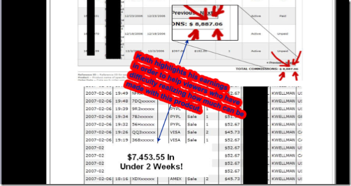
8) Showing charts and graphics of actually earnings CAUSED by using the product are very important for convincing your prospective buyer. Look what Keith does with his…he uses a few separate graphics from multiple places he collects income from (clickbank and other places). He also makes use of circling the bottom line with nice red ink.
9) Next comes the “Commercial Break,” which contains the punch list of questionable things the viewer may have. This punch list essentially gives you questions that all have YES answers, primarily because of the convincing you’ve been given after reading the sales page up to that point.
10) The next step is an important one because it puts this product (which is usually an electronic/digital item) into a hard and tangible form. With scripts used in Photoshop, web designers can easily take a flat image and turn it into a complete package of books, dvds and videos. Just look at the package graphic Keith came up with:

Now, keep in mind that Keith’s latest sales page is pushing 3 products as one package, so continuing with the sales page is pretty much a repeat of itself from steps 7-10. Regardless, this sales page construction almost guarantees a incredible sign-n-buy conversion rate.
Since Keith is pushing three products, it was a good idea to have those three items toward the end of the sales copy in an all-encompassing products images:

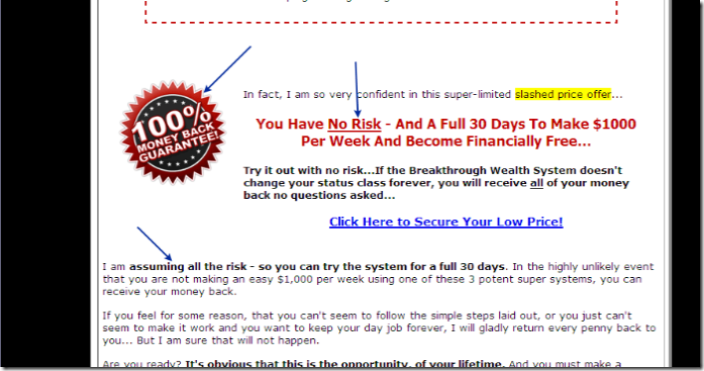
11) Offering a Money-back guarantee always reassures the prospective buyer that they are under no risk. Plus for the marketer, selling products through clickbank.com makes it easy to offer refunds because clickbank handles all of the chargebacks and other issues dealing with credit card transactions.
12) So now we are closing in on the end of this sales page deconstruction. What you want to do now is to offer some kind of interactivity to the user. This can be done by offering a list of questions with checkboxes to reassure their commitment to buy. However the checkboxes do nothing regarding the purchase of the product but are there for psychological reasons to help the perspective buy sign the deal.
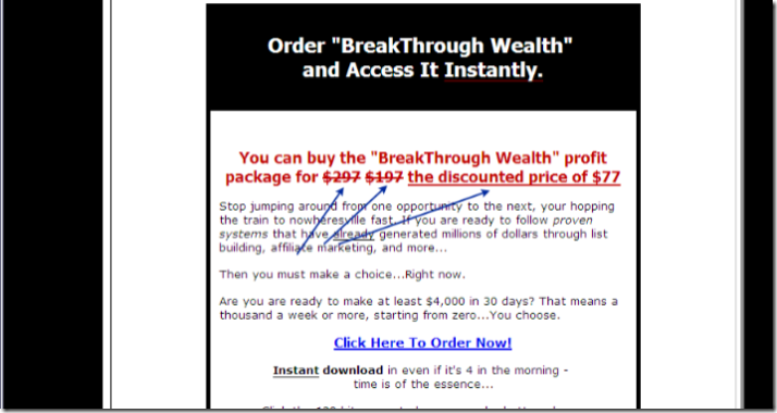
13) Always have the immediate mark-down. This is also called the discounted push price for the product. Just as when you are shopping at a department store, it is always persuasive when seeing a product marked down to a new discount…especially if it has been marked down atleast three times. Keith actually took this approach:
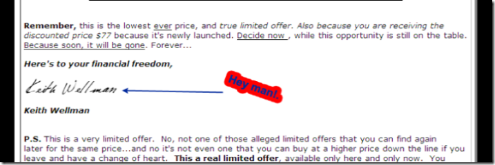
14) Finally, the salutation that seals the deal. The signature and the P.S. Ending a good sales page should always contain a positive wrap up with something authentic such as a signature. Some people have used script fonts to type their name, but more and more I see scanned signatures being used with more effectiveness:
So there you have it, one of the best examples of an effective sales page that can work for practically any product you are trying to sell. Keith did a great job at this one because his message is sincere and backed up with all the right words. Plus I know Keith and can actually hear his honestly when reading the sales pitch. Establishing trust and honesty are a few of the intangible items that must be conveyed in an effective sales letter.
Related Links:
I looked around forever to find a detailed description of exactly how I needed to make my sales pitch page look for my ebook that I am selling. Thank you for all of this advice! I just made the changes and will leave another comment to say how it all worked for me ! Thanks again!